Mobile app: Gale
Weather forecasts for water sports
UX/UI case study
October 2020

00. Kick-off
Project overview
Gale is a concept of the app which I create during my study at CareerFoundry. The app is designed for water activity enthusiasts, providing clear, simple, and precise reports to help people understand and enjoy the weather and stay safe at any time.
Skills
Research / User Experience / Prototyping / Usability Testing / UI design
Tools
Adobe XD / Survey Monkey / Optimal Sort / Unsplash
01. UNDERSTAND
Problem Statement
Our water-sports enthusiasts need a way to have simple, clear information about wind, wave, and weather conditions at any moment because they wish to plan their water activities with confidence about the weather and stay safe.
Product goals
Provide beautifully displayed and easy-to-understand wind, wave, and weather reports, forecasts, and statistics for sailors, surfers, divers, and any other water sports aficionado.
Basic App Feature Requirements
- An onboarding page
- A way to sign up and login
- A profile area
- A navigation menu
- A display of wind, wave, weather conditions in real-time
- Recommendations that can help users stay safe
Competitive Analysis
Once the problem statement was clear I started my research from the competitive analysis of Windfinder and Weesurf. I analyzed their key objectives, marketing profile, overall strategy, created SWOT and UX analysis.


02. Observe
Survey
As a first step of the observing phase, I decided to make a survey to get quantitative data about users’ needs and attitudes. I used SurveyMonkey as a tool and collect the results by the link in Facebook (French community of diving and sailing). 64 users took part in a survey.


Insights
- More than 70% check the weather on the phone, so the app is a priority.
- Wind, general meteo, waves, and visibility are the most important weather parameters.
- The top 3 features are interactive map, the possibility to save locations in favorites, and weather measurements in different metrics.
- The main frustration comes with no clear information and navigation of the app.
Interviews
As the second step, I conducted interviews by Skype with 3 potential users, who had experience in diving and sailing. I followed 3 main goals:
01
Understand user needs in a weather app, what kind of information they need out from there.
02
Documenting user opinions on competing weather sites.
03
Determining which weather apps or sites users enjoy using or leave them frustrated.
The results of the interview I turn to affinity mapping and made 3 iterations to find behavioral patterns and insights.
03. POV
Personas & Journey Map
Based on user research I identified 2 personas: sailor Maxime and diver Nicolas with different needs and goals. From this moment all that I did around Gale it is not just my thoughts or imagination. Every step is based on data and with a focus on both personas. I used journey maps to understand their thoughts and emotional experience while looking for the weather.


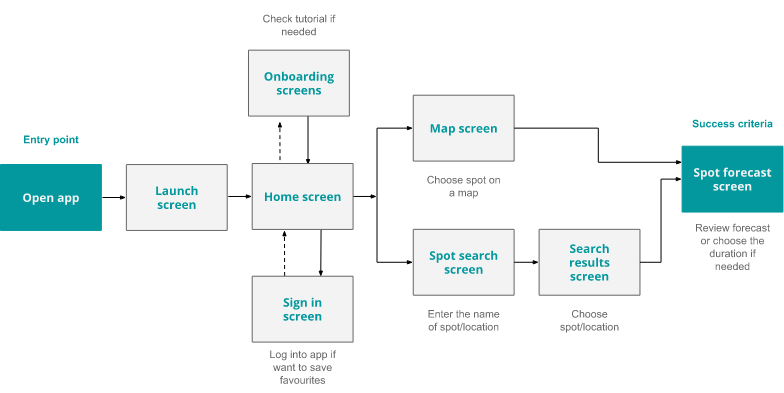
Sitemap
According to the survey users mainly check the weather on a mobile phone, so priority was given to the mobile-first design. I decide to use co-existing hierarchies to give the opportunity to the user to easily switch between features. Keeping in mind all the above I created a sitemap as a global view of the app screens and their connections.
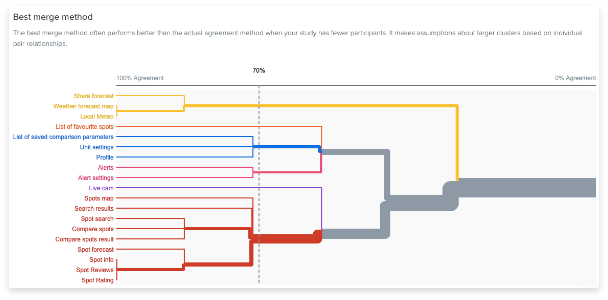
I did a card sorting to confirm the right of my choice for the information architecture. I used OptimalWorkshop and collected 12 responses.

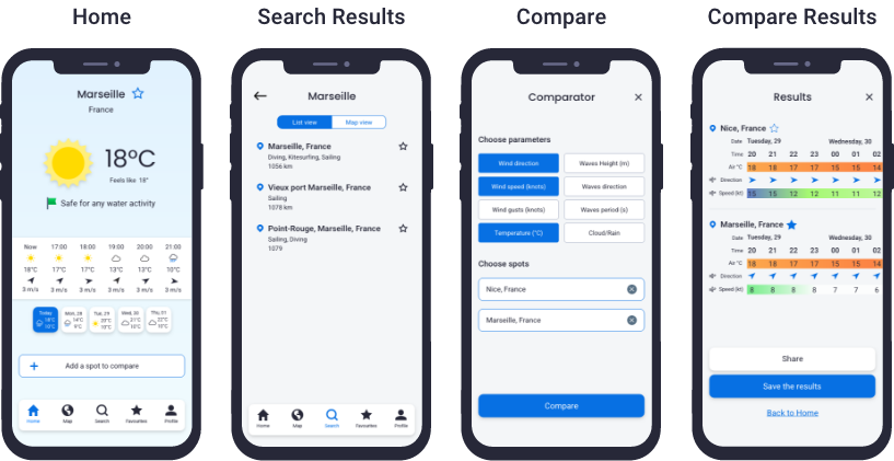
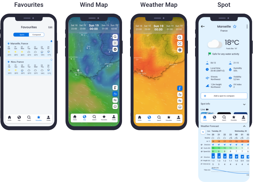
Wireframes and Prototype
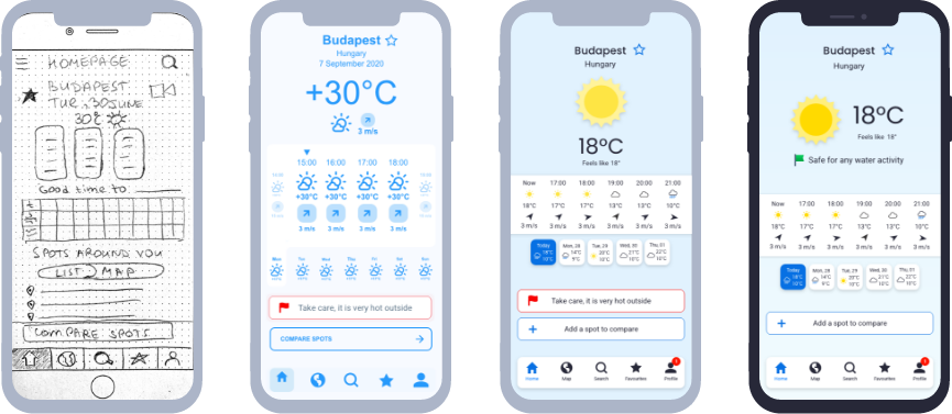
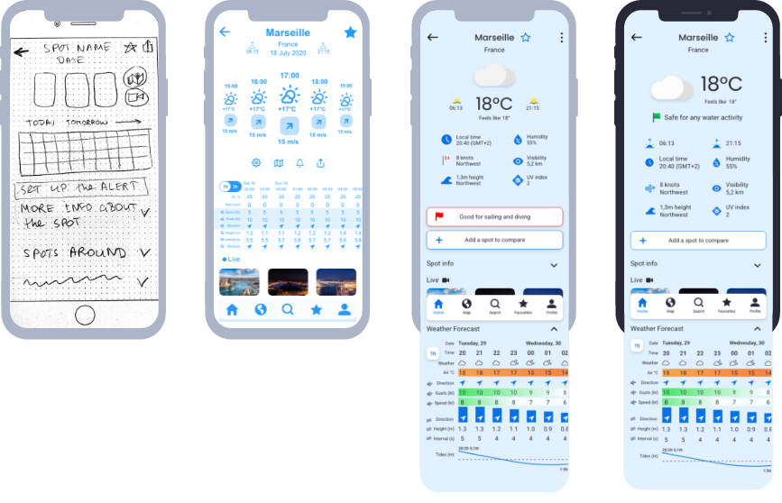
During the design process, I had several iterations for my app. All of them are crucial and brought a lot of value to my product. Changes from flow-fidelity to high-fidelity prototype I did base on the research results and my ideas. Then I performed usability testing, which helped me to improve the functionality of the app based on the user's feedback. The next iterations were about visual design and accessibility: what visual solution could work better for the app. Then this was tested and based on the peer’s feedback I made the improvements.
Home screen evolution
Spot screen evolution
05. TEST
Usability Test
The usability test has been organized twice. In both cases the goals of the test were:
- To assess the learnability for users interacting with the Gale app for the first time.
- To observe and measure if users understand the project, find it valuable.
- To confirm if the user understands how to complete basic initial functions such as logging in and searching for/comparing spot forecasts.
01
Mid-fidelity prototype test
- Moderated in-person (4)
- Moderated remote (2)
- 3 active practitioner of water activity
- 3 person without specific preference of water activity
All interview scripts I turned to affinity mapping and find common patterns for observations, errors, negative and positive quotes. I use this as input for the rainbow spreadsheet, where I evaluate each point (I measured errors by using Jakob Nielsen’s scale), set up the priorities, and defined an action plan.
02
High-fidelity prototype test
- Unmoderated remote (4)
- I used a CareerFoundry Slack channel to engage peers for design collaboration and collect their feedback.
I received all comments screen by screen on Adobe XD platform, so It was easy to set up an action plan and make improvements immediately.

TOP3 issues - Mid-fidelity prototype test

01
Issue: Not clear how to check the forecast for the next days.
Action: Add daily forecast on the homepage and the spot screens. User can see a short preview of the weather forecast and also click on the day and see more details.
02
Issue: Double icons for search and favourites feature on the home page.
Action: delete double icon for search; move the favourite icon close to the name of the spot on the right side.

03
Issue: Not possible to get from login to sign up screen.
Action: Make connection between screens and processes by link on the bottom redirecting user to correct place.
TOP3 issues - High-fidelity prototype test

01
Issue: Meteo part of the screen feels cramped.
Action: I moved Icon to the left and temperature to the right. Moved safety alert to this area and removed its borders.
02
Issue: Alert is looking like a button, but it is just information.
Action: Delete a border, change colour text and move to the weather information to be hierarchically visible with the most important information.

03
Issue: Clicking «add a spot to compare» open empty forms, but users expect it prefilled with user location.
Action: Add current location to compare screen with option to change it.

Final mockup
07. LESSONS LEARNED
It was important to made proper research and define personas with their journey map. It gave me a clear understanding of needs and expectations. This way the ideation phase was smooth and fun, but at the same time very productive and based on data. The iterative process was the best way to keep wireframes on the right way. Important to test each decision and iterate based on the user's input and always keep in mind that “you are not a user”. Visual design is aimed to support usability and user experience.